
Continuum Contemporary Music
Capturing the character of sound
The visual identity for a Canadian chamber music ensemble supporting new ideas and emerging artists is updated for the 2023 season.
-
Project
2022-2023 Season IdentityServices
Identity Design, Motion GraphicsIndustry
Arts - MusicRoles
Tiffany Smith - Graphic Designer, Art Director
Client
About Continuum Music
Continuum Contemporary Music (referred to as ‘CCM’ for short) is a Canadian chamber music ensemble based in Toronto, Ontario.
Back in 1985, a group of musicians and composers from the University in Toronto were challenged with finding an audience for their cutting edge music. Thus the musicians worked together to start their own organization built upon experimental and cutting edge musical leadership.
To this day, Continuum Contemporary Music has provided artists and musicians opportunities to explore and create outside of conventional music institutions, and has become a vehicle for meaningful artistic growth.
Annual concerts are composed and performed by highly trained classical musicians from diverse backgrounds, resulting in interesting and unique sounds that carry listeners to new places in space and time.


Objective
Sound =
Each year, Continuum Contemporary Music refreshes their visual identity to reflect the seasons’ programming, and to highlight the experimental and cutting edge spirit of the artists and musicians.
I was called on to design the identity and graphics for the 2022-2023 season’s programs; a milepost occasion following the previous years’ pause on live performances due to the coronavirus pandemic.
DELIVERABLES
Styleboards
Identity Design for 2023 Season
Media Templates
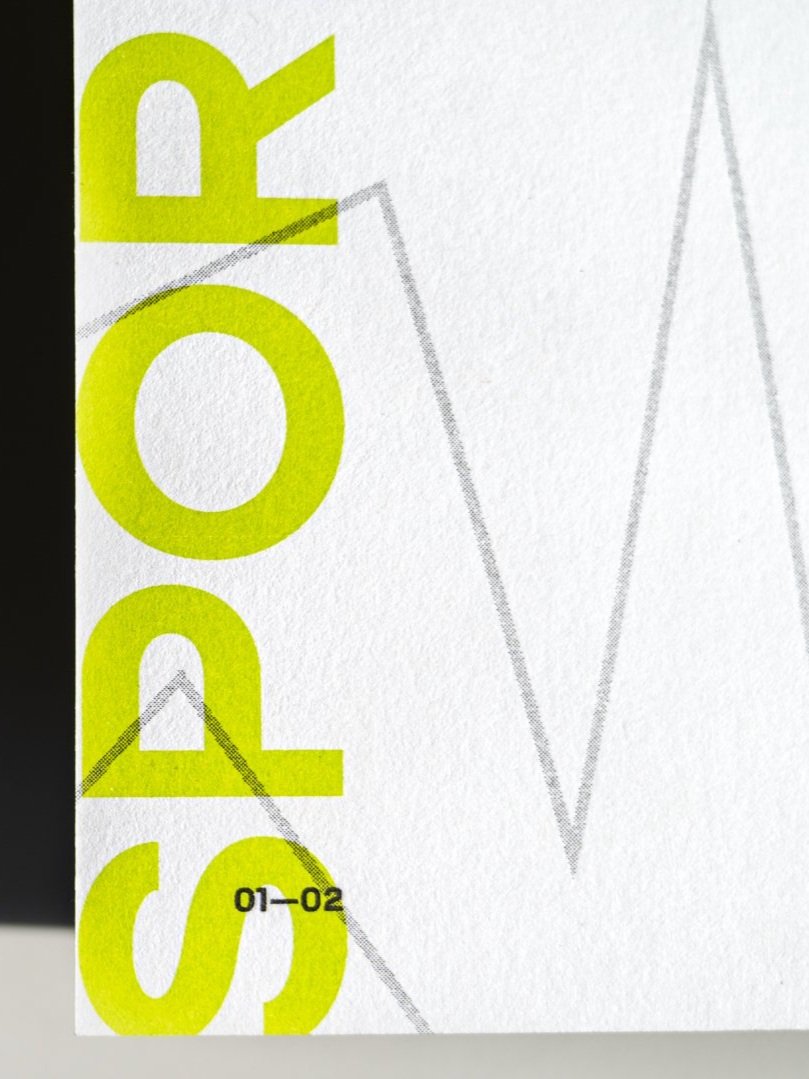
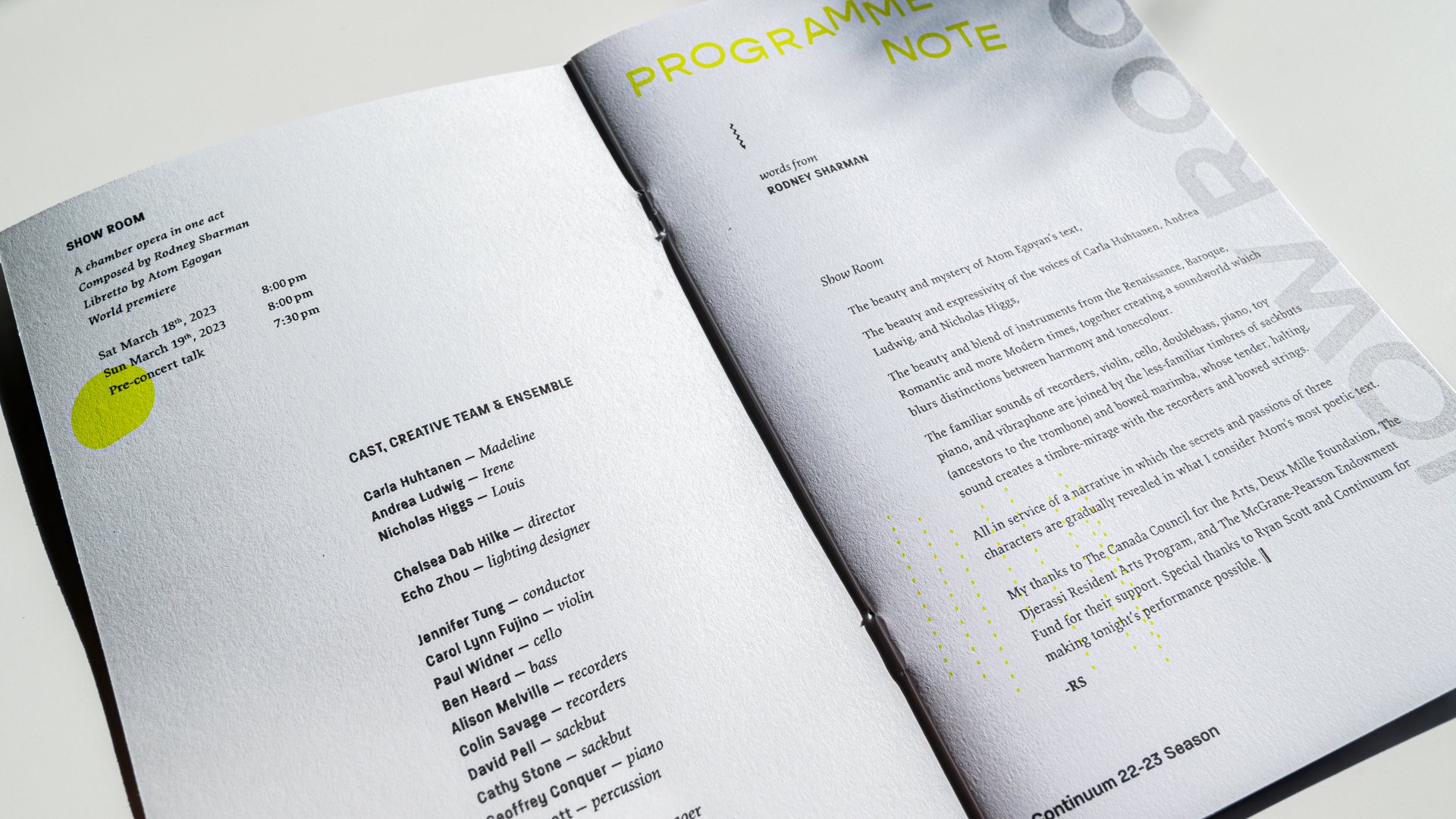
Riso Print Design
Motion Graphics


Hurdles
Problems to Solve

Develop cohesive creative assets for digital screens and risograph print
The visual identity for the season would mainly live on digital platforms. But brochures and postcards were also needed for announcing the performances. Colour selections, designs, and layouts had to be compatible for both mediums, with special consideration for risograph printing.
Representing musical energy while maintaining design functionality
The graphics needed to represent each unique program while balancing functional information like titles, contributors, and supporters.
Design Process
Rendering Sound into Visual Language
Listen to the music
Continuum Contemporary Music has a vast library of performances, interviews, and other content on their YouTube channel and archived on their website.
With so much to be inspired from, I became immersed in the music to gain a deeper understanding about the talent, background, and artistic approaches behind the work of the musicians in the CCM ensemble.
Color
Shape
Texture
After some deep exploration in music, books, videos, and much more, I resurfaced with several conceptual previs(ualization) styleboards for the visual identity that sought to express the artistic spirit of CCM’s ensemble through convergences in colours, shapes, textures, and space.

The first previs styleboard option that explored the overlaps between old and new, physical and digital, with combinations of typefaces, textures, and colours to visually convey CCM's artistic diversity and the idea of movement within the music.

The second previs styleboard option that explored the idea of nostalgia with a twist; mixing a quirky 1927 geometric typeface inspired by expressionist and modernist art movements with abstract shapes that bloom and contract to illustrate musical shifts from static to moving.
In the end, Christina Volpini, Composer & Operations Manager, and Ryan Scott, Percussionist & Artistic Director, landed on the visual direction inspired by the simple yet kinetic graphics and typography found on mid century jazz and classical music albums, and felt it that expressed the eccentricity of the musicians and their work.
↓

Details
Going Back in Time
Abstract graphics were common in visual communication designs from the mid-twentieth century. Some of the most interesting and spirited examples of this can be see on record album covers of that time.
When scouring through examples of jazz and classical album covers from the 1950’s and 1960’s, I was inspired to use quirky shapes and lines to express the relationship between the graphics and the music in a non-objective way.
By choosing a contemporary aesthetic rooted in mid-century art, I sought to layer nostalgia into the design to provoke a visual response with a sense of feeling.


Setting the Right Rhythm and Tone
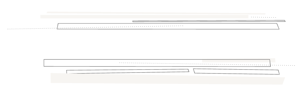
In the same experimental spirit as the music from CCM’s concerts, I explored different juxtapositions of mixed shapes and vibrant colour to create texture and tension in a way that would hint at the story and energy of the sounds through the eyes of the musicians.
While static, the graphics seek to visually convey the kinetic gestures, notes, and sounds, inspired by CCM’s remarkable musical performances.
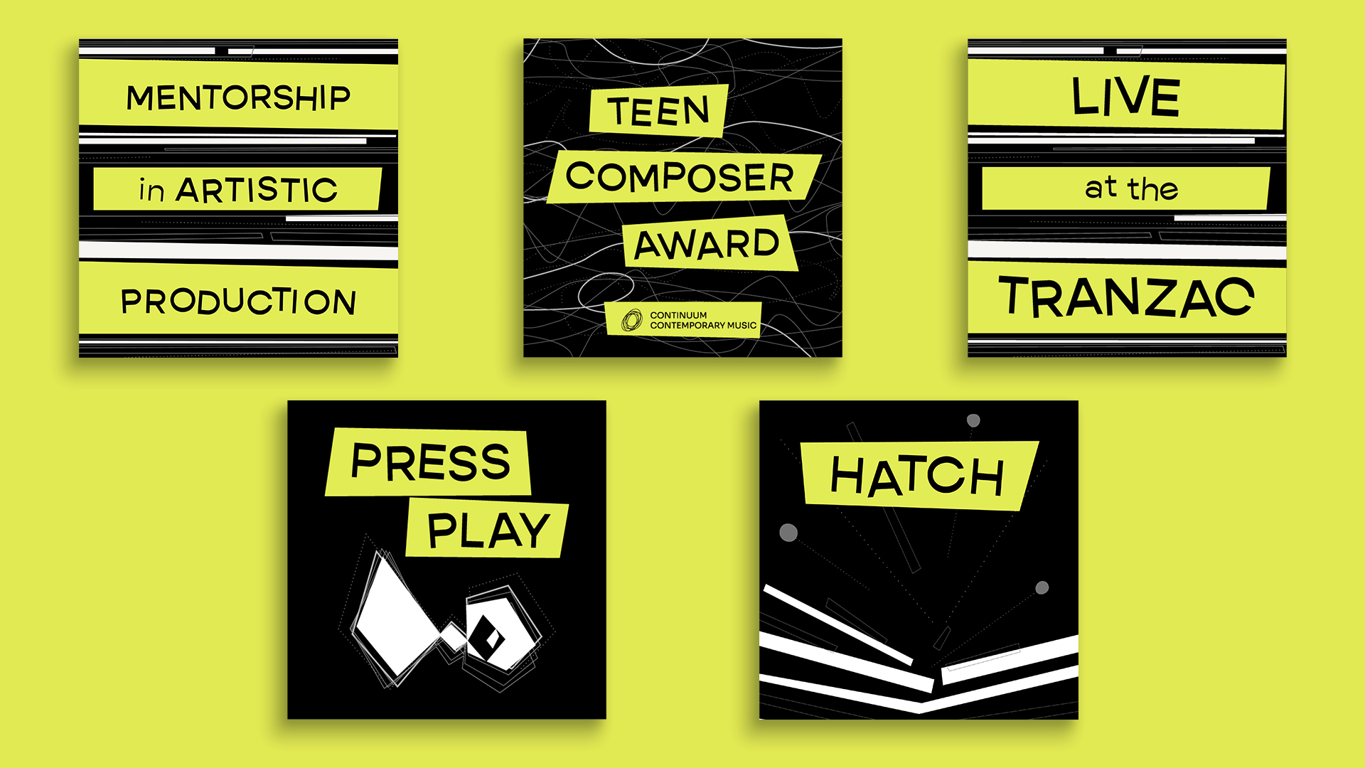
Finding the Beat with Offbeat Typography
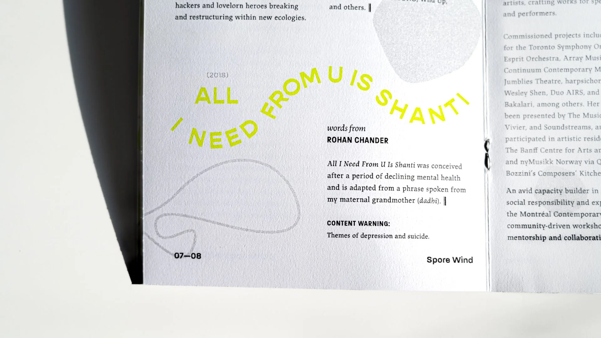
“Spore Wind” was just one of the concerts for the 2022-2023 Season. Included in the list of contributors to the performance was Bekah Simms, a Canadian composer.
When writing one of her past pieces of work “Bite,” composer Bekah Simms discussed how she used uneven spaces of silence to reflect the unsettled moments she experienced when quarantined at home during the coronavirus pandemic.
To amplify that idea and speak to CCM’s contemporary approach to musical composition, I selected a modern reverse contrast typeface with interesting counters, or rather, interesting negative spaces within the letters for the main program titles.


Vibratos in Type
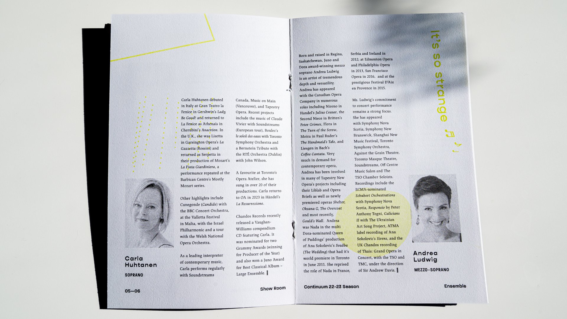
Show Room and Spore Wind were two major concerts for the 2022-2023 Season that required an accompanying riso printed program. Type on each page was interwoven with themed graphics, and arranged to demonstrate the energy and divergent musical compositions for each concert, keeping readers engaged as their eyes journey through the content.
The program books were finished in an 8”x10” format, folded, and saddle stitched. In order to accommodate that saturation of the black ink on the cover design, 80# Mohawk VIA Vellum Card was selected, while 80# Mohawk Via Vellum Text was chosen for the inside pages. To add a bright pop of colour, Light Lime ink was used for the graphics and other visual elements dispersed on the pages.


Media Graphic Designs and Templates to Build a Social Symphony From
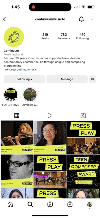
In addition to engaging with fans through social media, CCM also regularly uploads interviews, performances, and other content to YouTube. Video title cards, lower thirds, and end credits templates were designed to echo the visual identity across digital platforms.


Results
Pitch Perfect
“ I just want to share - we are SO thrilled! These designs represent the season and each concert so beautifully, and we can't thank you enough!
It's really clear how much time and consideration went into the individual concert designs, particularly Show Room and Spore Wind. “
Christina Volpini — Composer, Operations Manager, Continuum Contemporary Music

Bonus
I had created motion graphics with the shapes and colours from the identity to use as a thumbnail for my portfolio. CCM liked it so much that they asked to use it for part of the Spore Wind concert! See the video below where my motion graphic thumbnail is projected behind Bekah Simms as she discusses her piece.
Note: The graphics projected on the wall during the concert are not the ones I created. Those were created by artist Dan Tapper.